Case Study:
Shannon LaBare
Campaign Photography · Creative Direction
The Client
Shannon LaBare is the founder of Purveyor Marketing, a brand consultancy built around structured strategy and intentional creative direction for high-end businesses. She needed imagery that positioned her not just as a strategist, but as a creative force, someone her clients could trust with both the thinking and the taste.
The Brief
Shannon's work sits at the intersection of business precision and California cool, and her visuals needed to hold both without collapsing into either. The imagery had to work across her website, social, and client-facing materials, and had to speak to the full range of who she is as a founder: sharp, warm, and completely herself.
The Approach
We built three distinct characters to capture the full range of who Shannon is and who her ideal clients need to see before they hire her.
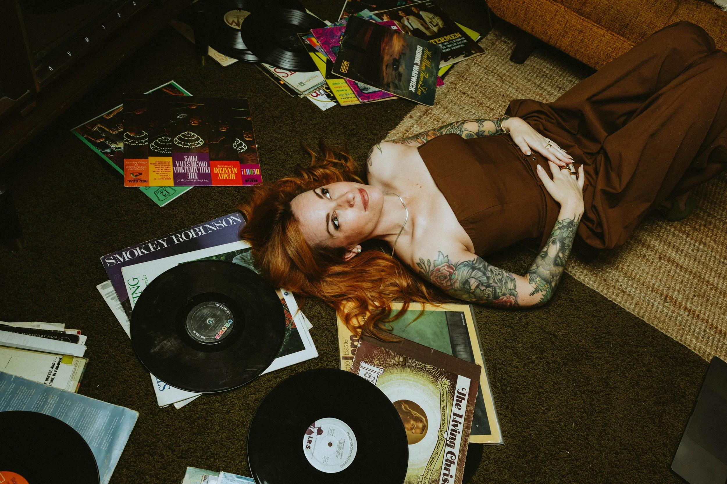
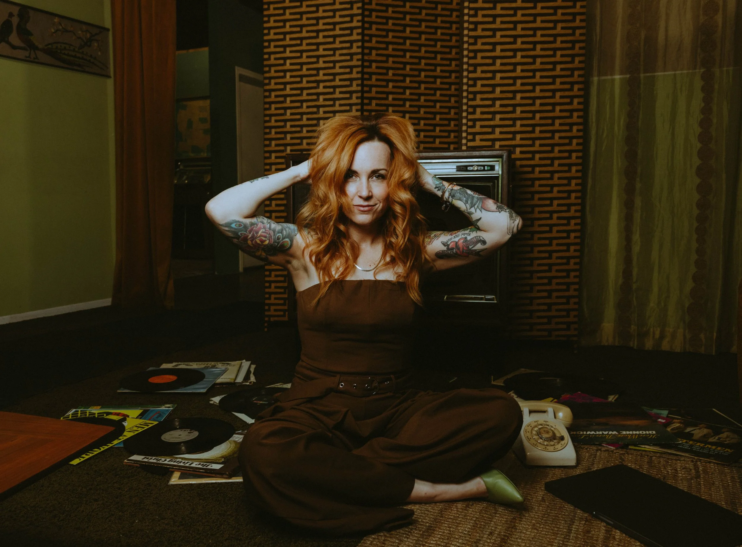
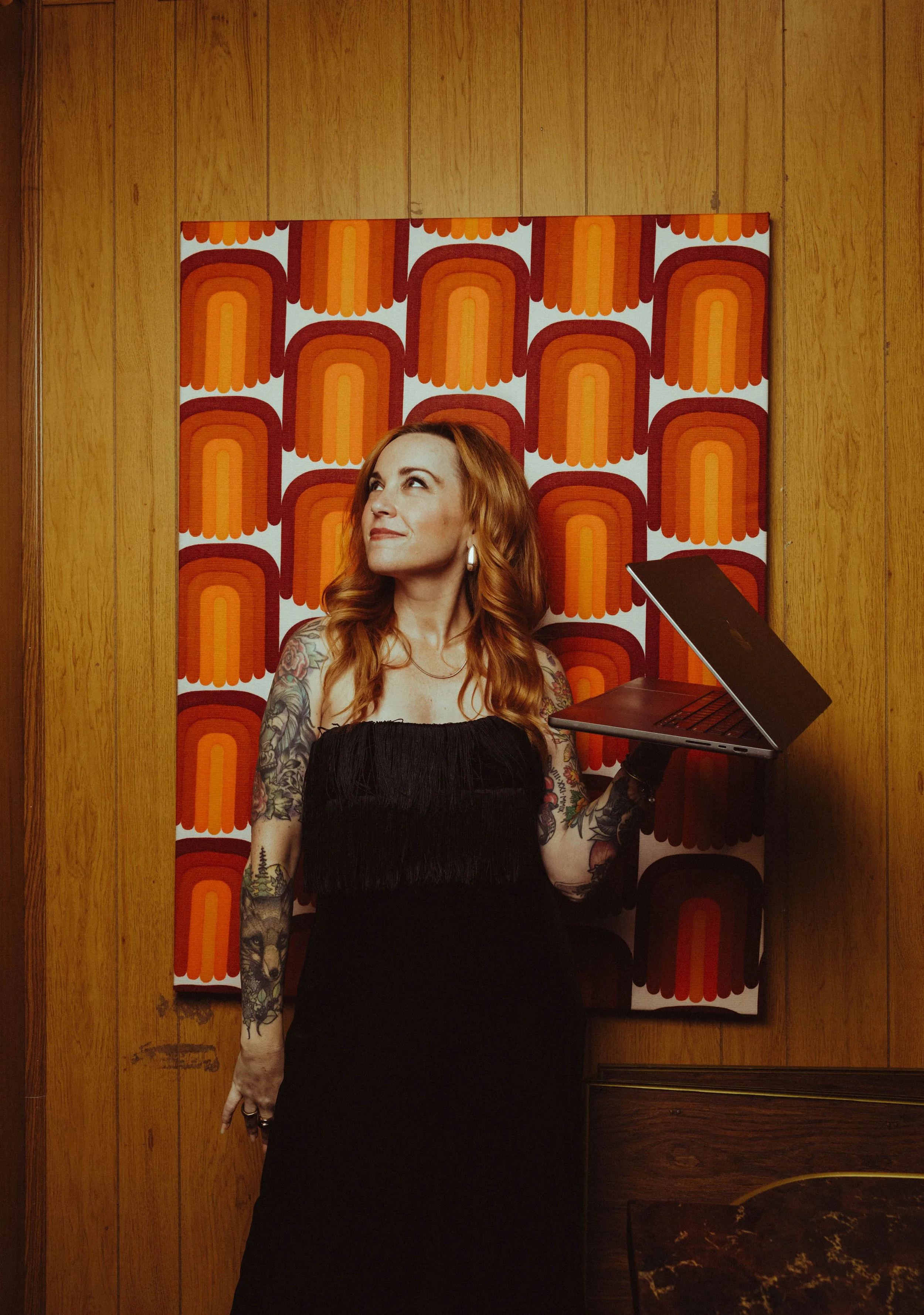
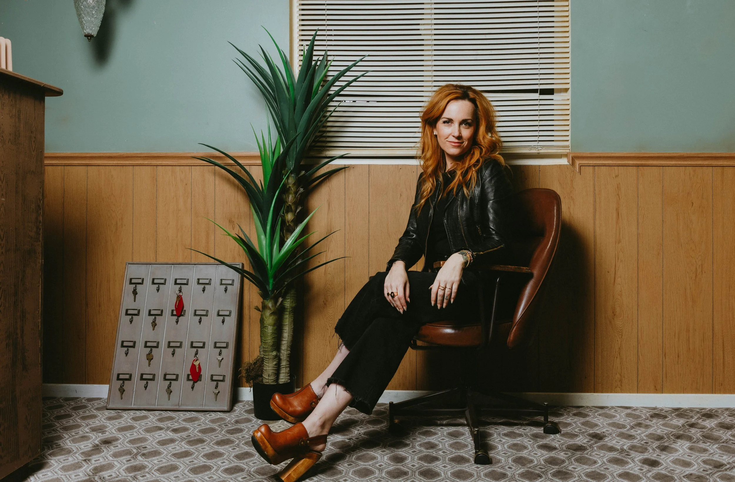
The Business Woman was cinematic and authoritative - harsh light, a 70s-inspired office set with a record player, wooden desk, and laptop in hand. This is Shannon, defined, credible, and in command.
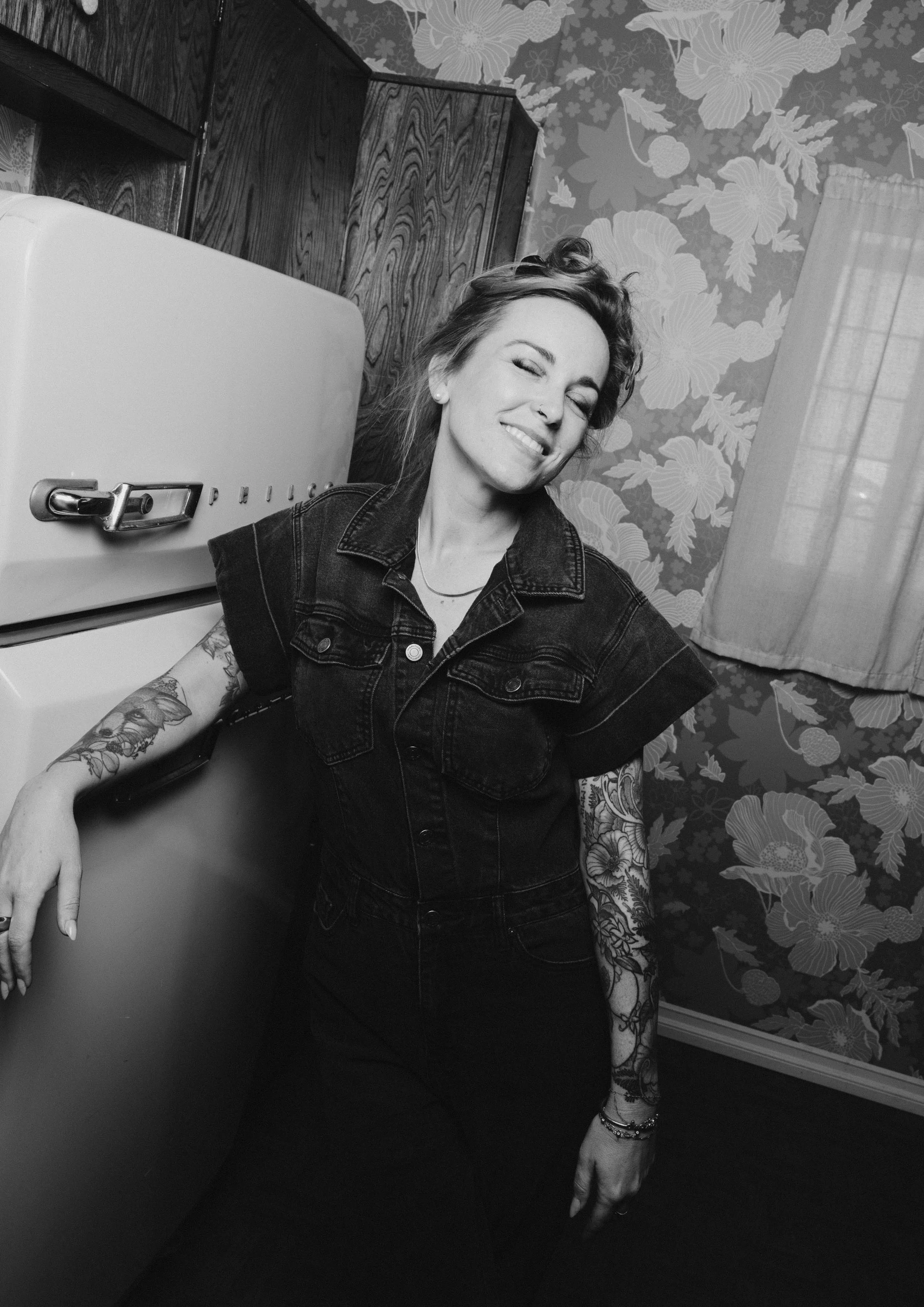
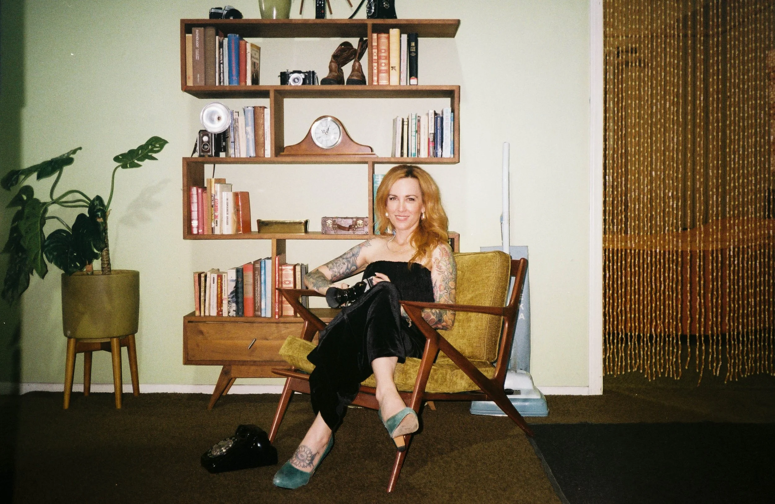
The Retro Rocker was magnetic and warm - soft flash, candid in-between moments, lived-in tones. The version of her that her best clients fall in love with before they even get on a call.
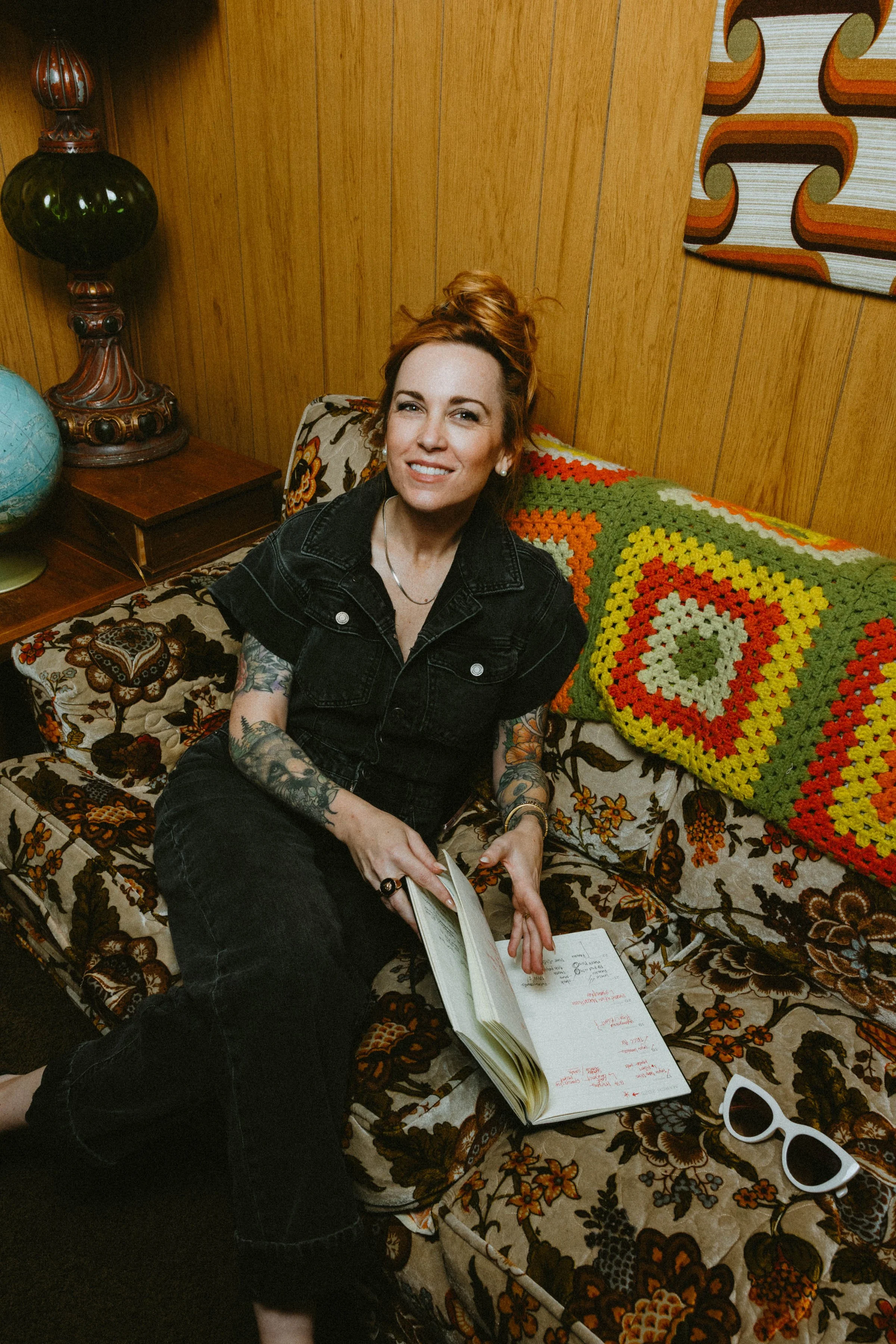
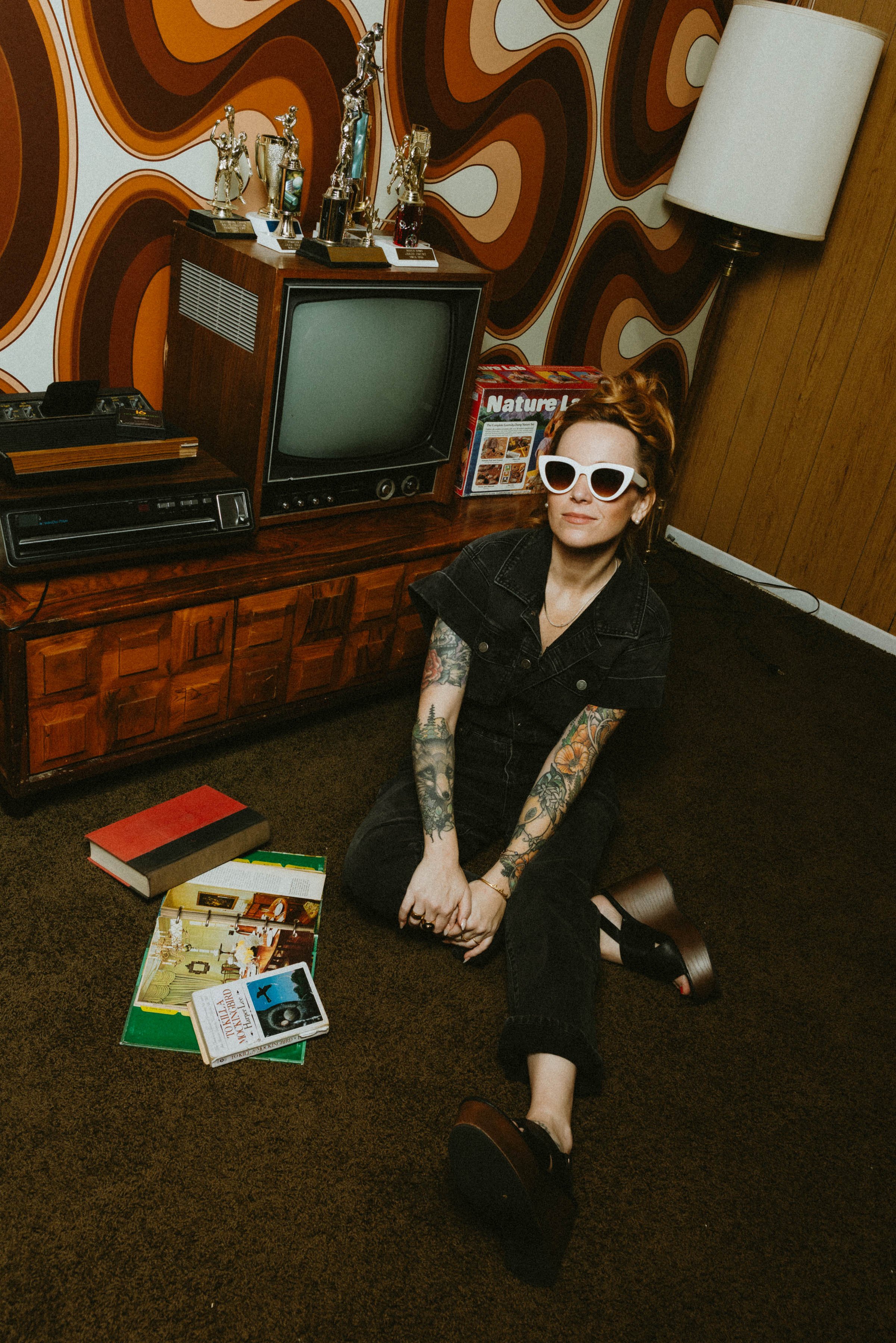
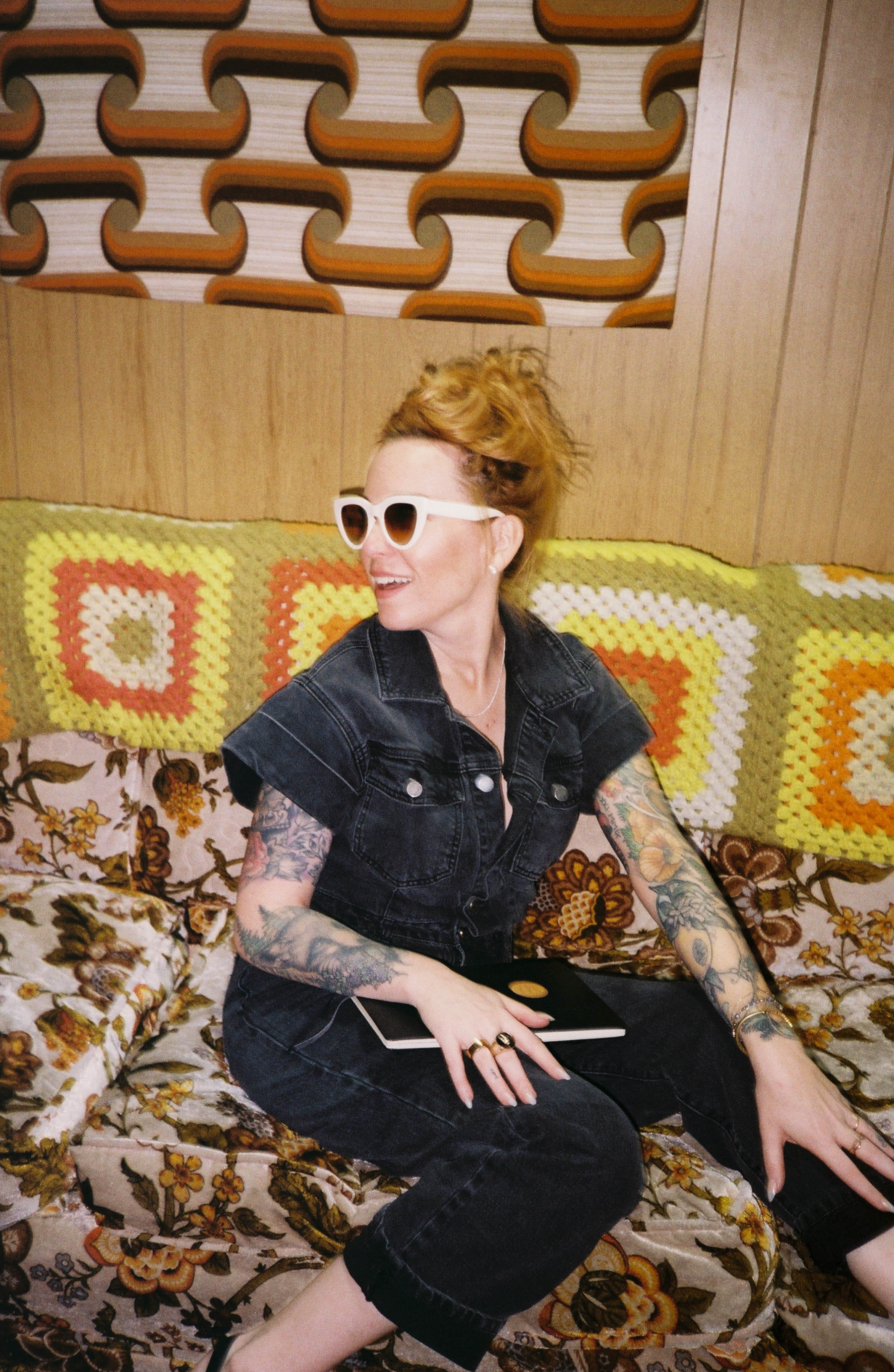
The Whimsy Creative was playful and human - color, texture, a retro couch, her notebook on the floor of a 70s-inspired space. Shannon is approachable, energized, and completely at ease.
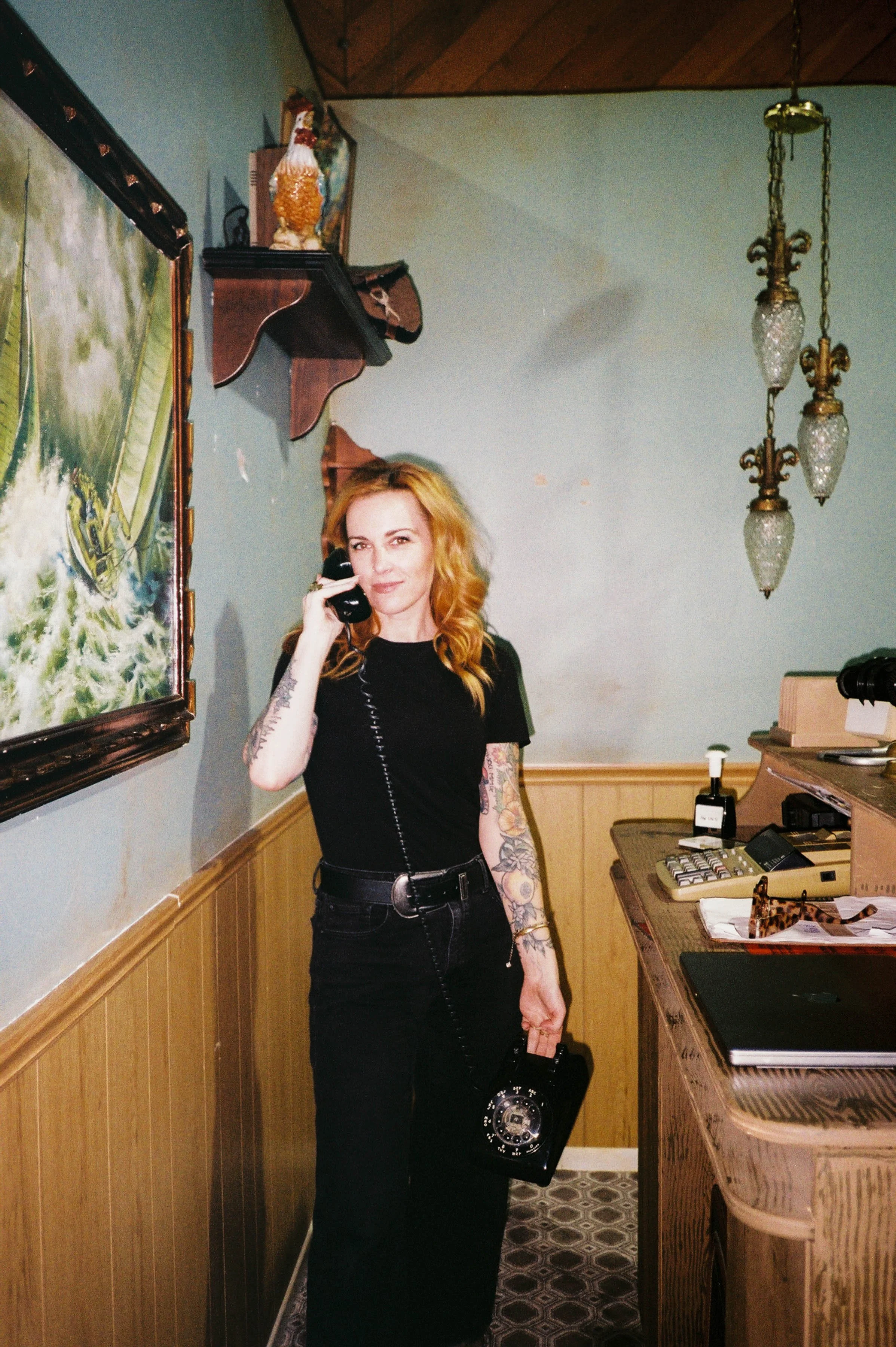
Props throughout e.g., records, her signature red hair color, an old phone - nodded to her California roots and music background as visual metaphors for rhythm, creativity, and momentum.

Three lighting treatments ran through the entire shoot:
Warm practical light with deep amber shadows for the floor and intimate scenes
Cool ambient window light, clean and controlled, for the authority setups
Black and white applied to the couch series - color stripped back, composition, and attitude carrying the frame
35mm film integrated throughout for texture and grain - only 11 frames from the roll made it, which is exactly the point.
The Outcome
Shannon launched with a visual identity that positioned her as both a strategic consultant and creative visionary. Clean, vintage, intentional - not sterile, not performative. A body of work that communicates consultant-level authority without losing the warmth that makes her impossible to ignore.